Mobile Responsiveness Tips
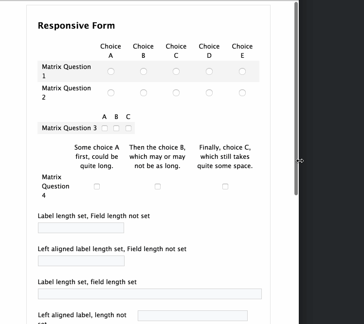
Forms, fields, and sections can now better adapt to the screen size of the viewing device. This includes dropdown fields with very long choices, as well as improved responsiveness when using a matrix.
Update your forms when prompted in the form builder for the best responsiveness.
Tips to get the most responsiveness from your forms
The suggested default width of most forms is 700px; however, you can retain responsiveness at other widths as well. Here's how to check the form width setting of your form:

- In Form Builder, click the Properties button.
- Choose Layout
- Navigate to the Width box.
Columns
Sections displayed in more than one column don't tend to adapt well when viewed on a mobile device. We advise displaying your form sections in either a grid, on one continuous line, or in one column to achieve the most responsiveness.
Portrait vs. Landscape Layout
In some cases, when viewing a form in landscape layout on an iOS device, the HTML text may appear larger than other text throughout the form. You can use the following custom code on your form to help with this:
<style type="text/css">html {-webkit-text-size-adjust: 100%;}</style>
Managing Forms
You are now able to manage forms on any device; however, a desktop is still recommended for using the form builder.