Introduction
A hint is a helpful little companion to a form field. They give you handy clues and directions about what's needed. Read more on our blog.
You can also see our example form for hints in action, or get the template.
Add a Hint
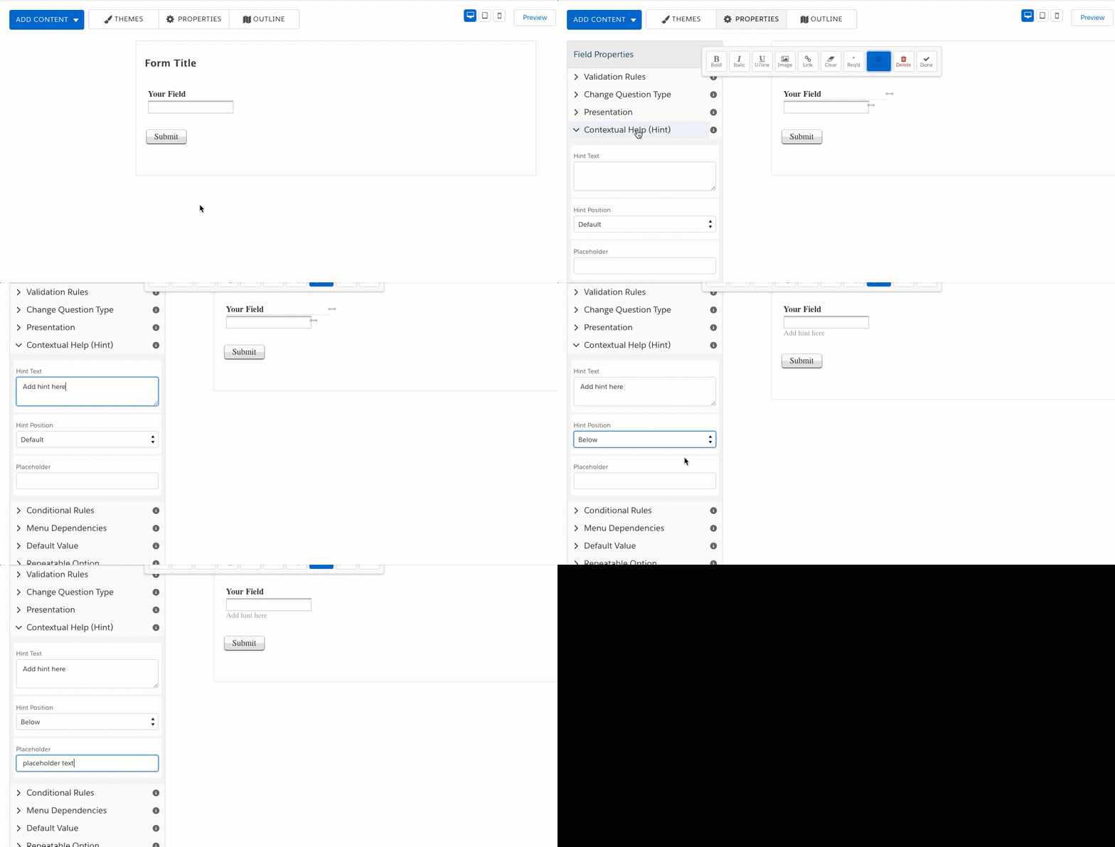
- Select the field by clicking within the highlighted area to bring up the editing toolbar.
- Click on the Options button.
- On the sidebar, click to expand the Contextual Help (Hint) menu.
- From here, you can type the help message, choose the location of the hint, and add placeholder text.

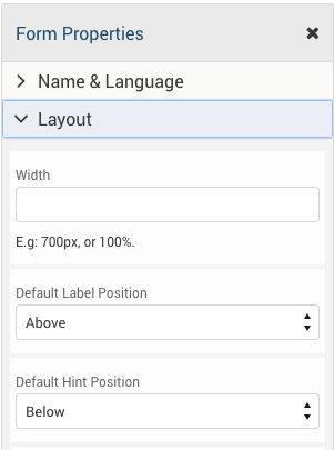
You can choose the hint location per field or change the default location for all fields on the form.
In the Layout settings of the Properties menu, you may select the form's settings for hint and label placement.

Placement
You can add hints below, on the side, in a pop-up, or as placeholder text. Each location has different benefits, so you should consider what you need and how your respondents will see the form. It's all about their experience, so you want the hints to be as helpful as possible!
Here's a handy pros and cons list:
Below

- Visible even when you're not typing in the field.
- Good if this hint should stand out with just a glance at the page. Otherwise, it can add clutter.
- Works better with less space (e.g. narrow form, sidebar form).
To the Side

- Just like the "below" hint, it's visible even when you're not typing in the field.
- Also good if this hint should stand out with just a glance at the page. Otherwise, it can add clutter.
- Best if you've got empty space on the side, in a full-page form.
As a Pop-Up

- Hidden until the field is selected, so it's clutter-free.
- Make sure it's something unique to the field, like an expected input format: mm/dd/yyyy
As Placeholder Text

- Most space-efficient and has nothing extra needed.
- Disappears as soon as the text is typed, which can be confusing if the respondent doesn't pay close attention. (If the field requires a very specific format, consider a Custom Format instead.)