Welcome to the Form Builder
Our Form Builder is a powerful, yet easy-to-use form building solution. Get started by simply dragging and dropping various field types into the canvas, then build complexity as needed with the available form options. Each section of this help document will discuss one aspect of our Form Builder and you can click on any of the provided links to learn more as you go. You'll be collecting data in no time!
Adding Content to your Form
Adding Form Fields
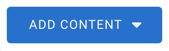
To begin, you’ll need to add any necessary fields to the Form Builder's canvas so that you can collect the data you need. Fields can be added to your form through the Add Content menu in your Form Builder:
We offer a number of field types, each of which can collect a particular type of data. Some of these field types include:
- Text Input Fields
- Radio Buttons
- Dropdown Menus
- Hidden Fields
- Checkboxes
- And more
You can read through this help document to learn more about the field types we offer.
Predefined Content
If you’d like to speed up this process, you can use Predefined Content to add common fields at just the click of a button! The Predefined Content menu contains a list of commonly used fields, or groups of fields. You can add your own Predefined Content to your menu anytime if there's a particular set of fields you hope to use in multiple forms.
Visible and Non-Visible Fields
For clean and efficient data collection, you will also need to choose which fields you want your respondents to see when they fill out the form. For example, you may want your respondents to fill in their first name and last name. However, you might also have a field which you'd like to remain hidden. Hidden fields can be prefilled with data without the respondent seeing them or editing them. You may also want to hide a field where you're performing calculations. You can either add a hidden field to your form directly, or you can make any field hidden by using Access Control options.
Hidden fields aren't the only way to prevent respondents from seeing what you don't want them to see. You can also use Conditional Rules and Menu Dependencies to conditionally show or hide fields and choices! Conditional Rules can be set up to show or hide a field, group, section, or page based on how a respondent interacts with a multiple choice field. Meanwhile, Menu Dependencies can be used to connect two dropdown menus. By setting one menu as the "parent menu" and one as the "child menu", you can have different choices appear on the child menu based on the respondent's selection in the parent menu.
Field Validation
Sometimes you want your fields to be visible, but only collecting specific types of data. You can add various types of validation to your fields to make sure that the data you want is being collected in the format you need. The most common way of implementing field validation is to mark a field as "required". This will require that your respondents fill out this field before they can submit the form! Besides this, you can use Validation Rules to require that a field response be submitted in a specific format such as a date, a number, or an email address.
Repeatable Fields and Sections
You can make your fields and sections repeatable if you need to collect additional data but don’t want your respondent to fill out the same form multiple times. Making a field or section repeatable causes a link to automatically appear next to it. This link can be clicked to "add another response" and clone this field or section so that the respondent can fill it out twice.
Form Calculations
Now that you have added fields and validations, consider if you need to add any calculations to your form. With calculations you can:
- Calculate totals
- Run a single line of JavaScript.
Being able to run a single line of JavaScript opens your form up to use cases such as double email field verification, If/Else statements, and more. While we do not assist in writing or editing custom code, we do have useable examples of these use cases and more in our documentation.
Themes and Branding
We love simple, elegant forms. But there’s nothing like adding your own unique branding to set your form apart! We have a variety of pre-made themes which you can use to quickly style your forms. You can preview any available themes under the "Themes" tab in your Form Builder:

If these aren’t your style, use the provided customization controls to make the theme your own. You can add even more flexibility by using custom code. We do not support custom code, but if you have some coding knowledge then you can add custom code to your forms in the Properties section. We have a list of the available controls in our documentation.
Form Name and Language
Your form actually has two “names”. The Form Name, which appears in your Forms List inside FormAssembly, and the Form Title, which appears inside the form itself. These two do not have to be the same! You can change the name you see in your Forms List by going to the Properties section in your Form Builder.

The Properties menu is also where you can set your Form Language. The language settings affect the system-created text such as error messages and the assistance links. They also change the date format for your form accordingly.
Form Outline
If you click on the “Outline” view in your Form Builder, you’ll see a list of all of your fields and sections. To the left will be the title of the field or section, and on the right will be that field or section’s alias. You can click on any field or section to jump to it immediately in the builder.
